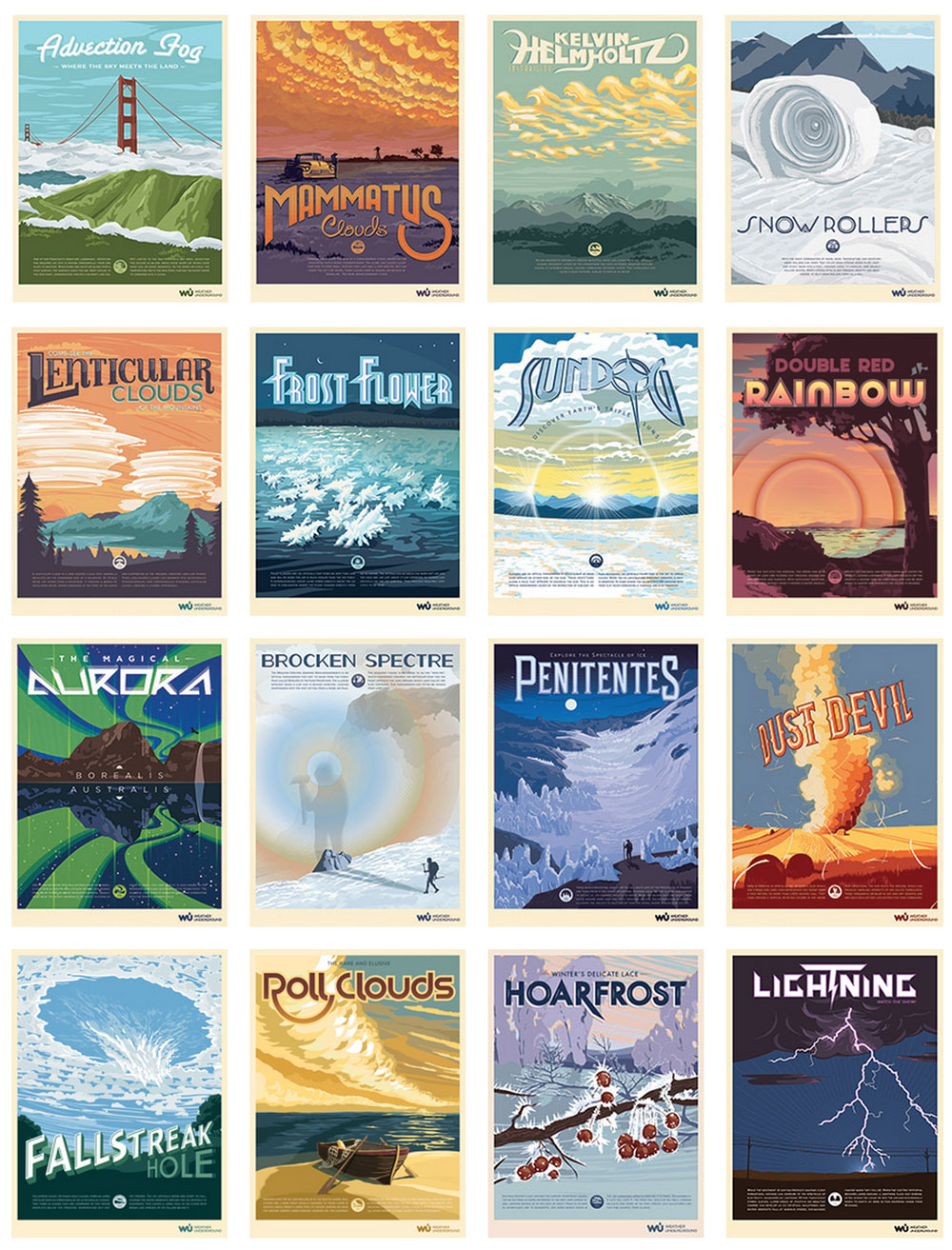
Inspired by traditional National Park Posters, the Wunder Poster Series allowed us to take various weather phenomena and illustrate these conditions for our community. Together the team designed a page for the posters to live. We formed a campaign in which users could submit weather conditions for their chance to have one of their photographs illustrated by us. We provided backgrounds for mobile devices and desktops, as well as postcards that could be run off on a home printer.
We framed and matted each poster for the office in San Francisco and provided downloadable postcards for users. We also provided wall papers and desktop backgrounds of each condition.
Page detail with supporting contest logo and iconography for each poster. The entire series can be found at WunderGround.com.
In 2014 the graphics team rebranded Weather Underground. A new identity and a slew of changes were given to the entire team. Here is some highlights from projects I worked on for Weather Underground.
After many thumbnails from each designer, we narrowed our decisions to two final designs. Once we polled the office, we then took the new logos to the street for users to vote—ultimately the design on the left would become our new mark.
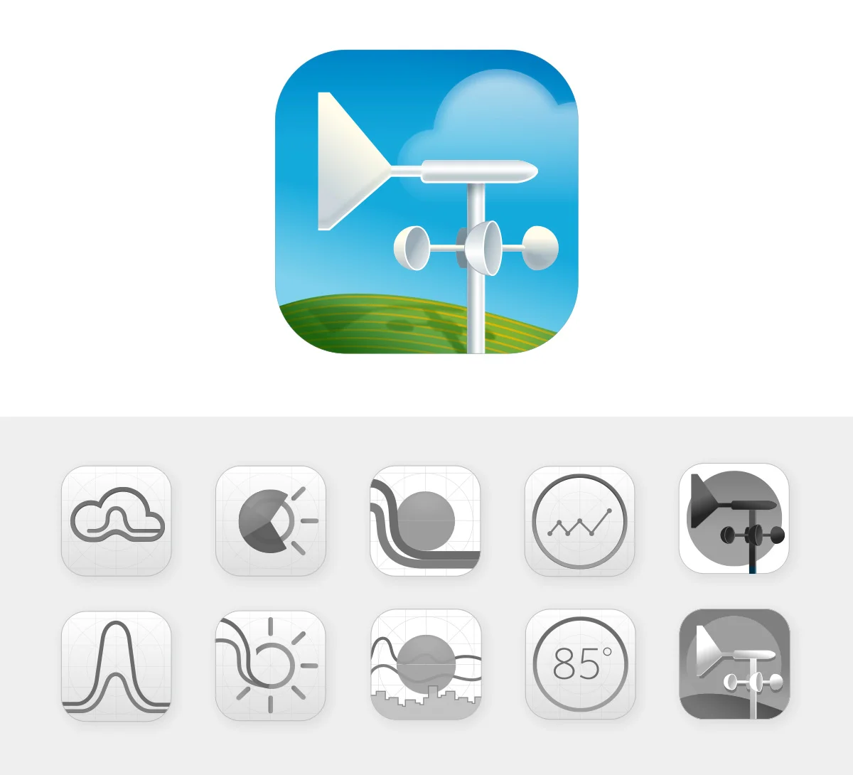
I was tasked with developing an icon conditions set for the new brand. This set was used in early mock-ups but not chosen for final implementation. The "wired" version of this set can also be seen below.
Post redesign I was tasked to give the infographics I had been creating a home. With the help of many meteorologist and a few developers I was able to design and launch the new page full of graphics. The design consists of both a landing and detail page. You can visit the finished product in the wild here.
I had the opportunity to create the icons for both WunderMap and WunderStation. Both Apps were selected to be featured by Apple in their "Best New Apps" section.
Early comps and finished color version.
Early comps and finished color version.
WunderMap and WunderStation were honored with the title "Best New Apps" from Apple.
When California Shower Door approached myself and fellow designer Chris Tung with the desire to overhaul their brand, we were excited to help. With over 80 years in the business CSD had a rich history founded on employee loyalty and hard work. After solidifying a new mark we moved into wire-framing the site and collecting photography to highlight their work. CSD's new identity has already offered them success in the field with customers and is now helping them generate new business.
Founded in 1935, California Shower Door receives an updated identity.
The Sanibel Sea School rebrand was full of opportunities to utilize my illustration background. Throughout the course of the project I was able to create many custom illustrations for the new site. With the help of fellow designer Chris Tung we were able to construct a look that was original and unique to their brand.